John Appleyard, updated 29th April 2020
Disclaimer: I trained as a physicist to PhD level many years ago, and my career required good numeracy. However, I have no special expertise in epidemiology or statistics. I intend to update this paper and a list of calculated real infection rates regularly.
1. Introduction
 In this note, I will show that a straightforward mathematical model linking testing with confirmed cases and deaths is confirmed by analysis of published data. The resulting equation can be used to deduce real infection rates at any point in time. The model does not predict the future. Instead, it allows us to work out what published data can tell us about the true situation on any given date. The implications of unreported Covid-19 deaths are also discussed.
1.1 Why is that Important?
Knowing what is happening is vital to rational decision making. Currently there appears to be a general understanding of the effect of testing on case numbers. This model provides a quantitative framework for that understanding. In cases where the true infection rate is determined accurately by random sampling, it should be possible to use the results to refine this model, allowing more precise estimates of infection rates where sampling evidence is not available.
2. The Model for Covid-19 Testing
A detailed mathematical description of the model is available here. This section contains a simplified version which describes the model behaviours when the number of confirmed cases is small, and when it is large, but not in the intermediate region.
If testing were random, the number of cases, C, found by T tests in a population P will be approximately:
C = I.(T/P)
where I is the total number infected. We don’t know I, but it’s related to the number of deaths by the infection fatality rate, f=D/I, so
C = (D.T)/(f.P)
This is model 1. Ideally, D should be time shifted to account for the delay between infection and death.
In the early stages of the pandemic, testing is not random, but is designed to find as many cases as possible. It focuses on a small part of the population comprising the contacts of existing cases, medical staff, and those with symptoms. If the size of that reduced population is proportional to C, then the number of cases found will be
C = (D.T)/(f.n.C)
C = sqrt((D.T)/(f.n))
where n is the constant of proportionality. This is model 2.
In effect, testing is concentrated on a bubble of contacts surrounding each case, and for small C (model 2), these bubbles are isolated. As C increases, the bubbles increasingly overlap, and eventually model 1 prevails.
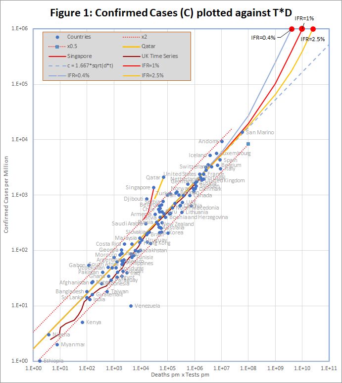
3. Comparison with Published Data
The data, downloaded from worldometers.info at the end of the 20th April 2020, comprises 3 variables for each of 115 countries with more than 100 cases, and at least one death. China is excluded because testing data is not available. The variables are the number of confirmed cases (C), deaths (D), and tests (T) per million of population. Some historic data, from the UK, Qatar and Singapore is also plotted as coloured traces.
Figure 1 shows that the data fits very well to the equation
C = 1.667 *sqrt(D*T)
The match spans almost 4 orders of magnitude, but even so, almost all countries are within the tramlines, which indicate a factor of 2 either side of the predicted value.
The red dots at the top of the chart represent the hypothetical situation in which the number cases approaches saturation (C = 1 million), and the eventual infection fatality rate (f) is 0.4%, 1% or 2.5%. The curves projecting down from those points show the trajectories predicted by the detailed model which end at each point.
There are many reasons to expect data from different countries to differ, including:
- Different health systems – some primitive, and others advanced
- Overloading makes even advanced health systems less effective
- Different demographics – Covid-19 is worse for older populations
- Time lags – e.g. confirmed cases may not survive, and reports may be delayed
- Different criteria for counting deaths
- Political massaging of published data
The conclusion is that all of these factors combine to a factor of up to about 2.
There are 2 interesting exceptions on the chart, namely Qatar and Singapore. In Singapore, the number of cases increased by a factor of 3.8 in a period when the number of tests increased by only 1.3. For Qatar it was 2.4 and 1.4. In both cases, the increase seems to caused by the discovery of infection hot-spots among expatriate workers. For example the Singapore MOH issued a press release on 20th April saying “As of 20 April 2020, 12pm, the Ministry of Health (MOH) has preliminarily confirmed an additional 1,426 cases of COVID-19 infection in Singapore, the vast majority of whom are Work Permit holders residing in foreign worker dormitories. 16 cases are Singaporeans/ Permanent Residents.” This point is discussed further below.
Venezuela is an obvious outlier. It is reported as having conducted more tests per case than any other country. Second is Hong Kong, a factor of 9.5 behind. Djibouti and Gabon are also outliers with 2 and 1 deaths respectively.
4. Predicting the Real Infection Rate
The model predicts that when C is small, it varies with the square root of the number of people who have been tested. That means that we can predict I, the number of cases that would be found if we tested the entire population (P) using
I = C*sqrt(P/T)
However, this simple formula breaks down as C increases, because it depends on the assumption that there is no overlap between the contacts of individual cases. A more thorough, but somewhat mathematical theory, which allows for that overlap, is described in this note.
The more detailed theory requires an estimate of the infection fatality rate (IFR) – the percentage of all infected patients who will eventually die. That number may vary between countries, but is probably a little over 1% in Europe and North America.
Table 1 shows the top 50 countries as of 20th April. There are estimates of the real cases per million for the simple extrapolation, and for the detailed model with different assumptions about the IFR. The multiplier is sqrt(P/T), and is an indication of the likely error in the figures: a high value means that the model is extrapolating further and may be more error prone.
Table 1 Reported and “Real” Cases per Million – 20th April
| True Cases % | |||||
| Reported Cases / M | Multiplier | Simple Model | IFR=1% | IFR=2.5% | |
| Andorra | 9,280 | 4.43 | 6.31% | 9.48% | 7.18% |
| San Marino | 13,616 | 8.46 | 6.04% | 12.30% | 7.62% |
| Spain | 4,282 | 6.80 | 3.04% | 4.48% | 3.44% |
| Belgium | 3,450 | 7.09 | 2.92% | 4.45% | 3.34% |
| France | 2,380 | 6.58 | 2.82% | 3.84% | 3.12% |
| Luxembourg | 5,684 | 11.87 | 2.45% | 2.93% | 2.61% |
| UK | 1,838 | 13.26 | 2.44% | 3.18% | 2.66% |
| Ireland | 3,170 | 10.00 | 2.34% | 2.84% | 2.51% |
| USA | 2,395 | 6.21 | 2.17% | 2.62% | 2.32% |
| Isle of Man | 3,528 | 11.63 | 2.05% | 2.44% | 2.19% |
| Channel Islands | 2,807 | 7.38 | 2.03% | 2.47% | 2.18% |
| Switzerland | 3,229 | 7.24 | 2.01% | 2.48% | 2.16% |
| Italy | 2,997 | 9.07 | 1.97% | 2.83% | 2.21% |
| Netherlands | 1,950 | 4.30 | 1.95% | 2.50% | 2.12% |
| Sweden | 1,463 | 5.82 | 1.70% | 2.09% | 1.83% |
| Panama | 1,035 | 6.57 | 1.56% | 1.68% | 1.60% |
| Iran | 994 | 7.76 | 1.53% | 1.73% | 1.60% |
| Iceland | 5,196 | 15.42 | 1.46% | 1.58% | 1.50% |
| Qatar | 2,088 | 6.96 | 1.39% | 1.43% | 1.41% |
| Portugal | 2,046 | 7.02 | 1.35% | 1.53% | 1.41% |
| Ecuador | 574 | 8.21 | 1.34% | 1.44% | 1.38% |
| Germany | 1,755 | 7.05 | 1.22% | 1.37% | 1.27% |
| Turkey | 1,079 | 6.15 | 1.21% | 1.29% | 1.24% |
| Mayotte | 993 | 5.69 | 1.21% | 1.27% | 1.23% |
| Moldova | 632 | 2.81 | 1.17% | 1.24% | 1.20% |
| Austria | 1,643 | 15.03 | 1.15% | 1.28% | 1.20% |
| Serbia | 759 | 23.32 | 1.10% | 1.16% | 1.12% |
| Singapore | 1,370 | 13.25 | 1.08% | 1.10% | 1.08% |
| Denmark | 1,297 | 11.19 | 1.01% | 1.13% | 1.05% |
| Israel | 1,584 | 13.98 | 0.95% | 1.01% | 0.97% |
| Djibouti | 856 | 13.70 | 0.94% | 0.96% | 0.95% |
| Norway | 1,320 | 14.18 | 0.81% | 0.88% | 0.84% |
| Canada | 976 | 6.00 | 0.80% | 0.88% | 0.83% |
| North Macedonia | 588 | 7.89 | 0.78% | 0.84% | 0.80% |
| Peru | 495 | 9.67 | 0.74% | 0.78% | 0.75% |
| Chile | 550 | 18.52 | 0.70% | 0.73% | 0.71% |
| Finland | 698 | 13.30 | 0.68% | 0.72% | 0.69% |
| Armenia | 452 | 12.14 | 0.67% | 0.70% | 0.68% |
| Estonia | 1,157 | 14.46 | 0.66% | 0.71% | 0.68% |
| Romania | 465 | 6.41 | 0.65% | 0.70% | 0.67% |
| Belarus | 663 | 14.93 | 0.64% | 0.66% | 0.64% |
| Montenegro | 497 | 26.99 | 0.63% | 0.66% | 0.64% |
| Dominican Republic | 458 | 12.42 | 0.63% | 0.67% | 0.64% |
| Croatia | 458 | 13.85 | 0.57% | 0.60% | 0.58% |
| Bosnia and Herzegovina | 399 | 13.29 | 0.53% | 0.56% | 0.54% |
| Brazil | 192 | 5.95 | 0.52% | 0.55% | 0.53% |
| Algeria | 62 | 22.32 | 0.51% | 0.53% | 0.52% |
| Czechia | 644 | 82.20 | 0.51% | 0.54% | 0.52% |
| Bahrain | 1,121 | 12.73 | 0.49% | 0.50% | 0.49% |
| Albania | 203 | 14.89 | 0.45% | 0.47% | 0.46% |
5. US and UK Time Series with Time-Shifted Death Data
29th April – a major update of this section will be posted in the next day or so.
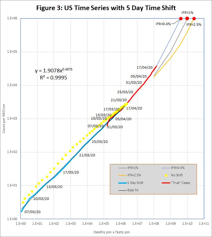
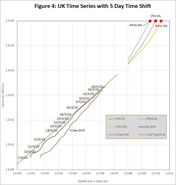
Although the hypothesis of section 1 appears to fit the data well, it was noted in section 2 that D should be time shifted to account for the delay between infection and death. In this section, I will examine this idea using time series data for the UK and US.Historic data for the UK and US was downloaded from https://github.com/tomwhite/covid-19-uk-data/blob/master/data/covid-19-indicators-uk.csv and https://covidtracking.com/data/us-daily.A preliminary study with varying number of days’ shift applied to the death statistics, established that for the US, a 5 day delay produced a clearly visible improvement in the fit to the data. For the UK, there was no clear trend.
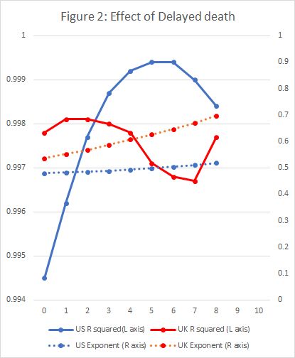
Figure 3 shows the resulting plots of C against T.D for the US. The yellow dots are the unmodified US time series, which shows a noticeable bulge above the straight line. This is to be expected in the exponential growth phase because deaths are systematically understated. The blue line shows the same data, but with a 5 day shift applied to death data, and the bulge is eliminated. Both lines converge to the standard formula as time progresses.The red line shows the prediction of real cases per million on each date. This is based on extrapolation to complete testing, as described in Section 4, and using an IFR of 0.4%.
The UK data, in Figure 4 is less straightforward. The unmodified data (blue line) does not show the bulge expected in the exponential growth phase, but does seem to be converging to the standard model. The time shifted red line does not look like an improvement.
6. What about Deaths that are not reported?
It is known that Covid-19 deaths are under-reported in many countries. For example, the UK has, until now, reported only deaths in hospital, and not, for example, those in care homes, even if they have previously tested positive for Covid-19.In other countries there are reports of mass graves for people who have died, presumably from Covid-19, without appearing as a case or a death in official figures.
It’s difficult to reconcile this with the apparent precision of the predictions of the model. But the fit is just too good to have arisen by chance – it must be telling us something.
I suggest that the answer is that, in many countries, there are two populations. One that is “in” the system, and will be tested and end up in hospital if they get ill. The figures we have relate to solely to that population. The other “out” population is not tested, and if they die, do not die in hospital.If that is the case, then the value of P we use in the equations should not be the total population of the country, but the number who are “in” the system of testing and hospitalization.
That makes no difference for C<<f.P: the equation for model 2 in section 2 does not depend on P. This is why the model works for countries with very large “out” populations. For C>>f.P on the other hand, the prediction veers away from model 2 towards model 1, which does depend on P. As a result, countries with large “out” populations will diverge from the straight line of model 2 sooner than expected.
This idea may also shed some light on why Qatar and Singapore appear to be diverging from the model. Some of the “out” population (expatriate workers) are joining the “in” system. Something similar could happen in the UK, when care home deaths are properly reported.
7. Additional Notes.
(1) The reporting of test numbers can be problematic. The model assumes that the “number of tests” is the number of people tested, and that second and third tests on the same individual are discounted. Some countries (e.g. UK) make that distinction clear, though worldometers.info currently reports the higher figure (total number of tests). In other cases, the test numbers are not regularly updated (e.g. Germany).Currently, these and other imperfections appear sufficiently small that the data remains within the x2 tramlines.
(2) If you would like a copy of the Excel spreadsheet containing the workings and charts from this report, please contact me via the Contact Form at www.fortran.uk.