This version is no longer current – please see
https://fortran.uk/using-published-covid-19-data-to-deduce-real-infection-rates/
John Appleyard, updated 23rd April 2020
Disclaimer: I trained as a physicist to PhD level many years ago, and my career required good numeracy. However, I have no special expertise in epidemiology or statistics.
1. Introduction
In this note, I will show that a simple model of linking testing with confirmed cases and deaths is confirmed by analysis of published data. The resulting equation can be extrapolated to predict true infection rates. It is argued that, although the model must break down for high infection rates, the way in which it breaks down can be anticipated.
2. The Model for Covid-19 Testing
If testing were random, we would expect the number of cases found (c) to be proportional to the number of tests (t), and the proportion of the population that is infected. The second factor is unknown, but the number of deaths (d) is probably a reasonable proxy, so we have:
c ∝ d.t
A better proxy for the infection rate now might be the death rate in a few days time, but initially, we will use the simpler model.
In the early stages of the pandemic, testing is not random, but is designed to find as many cases as possible. It focuses on a small part of the population comprising the contacts of existing cases, medical staff, and those with symptoms. If the size of that reduced population is proportional to c, then the number of cases found will be
c ∝ d.t/c
c ∝ sqrt(d.t)
In effect, testing is concentrated on a bubble of contacts surrounding each case, and for small c, these bubbles are isolated. As c increases, the bubbles increasing overlap, and eventually encompass the entire population. At that point testing effectively becomes random, with c ∝ t.
To summarise, the hypothesis is that c should vary with sqrt(d.t) for small c, and with t for large c.
3. Comparison with Published Data
The data, downloaded from worldometers.info at the end of the 20th April 2020, comprises 3 variables for each of 115 countries with more than 100 cases, and at least one death. China is excluded because testing data is not available. The variables are the number of confirmed cases (c), deaths (d), and tests (t) per million of population. Some historic data, from the UK, US, Qatar and Singapore is also plotted as coloured traces.
Figure 1 shows that the data fits very well to the equation
c = 1.667 *sqrt(d*t)
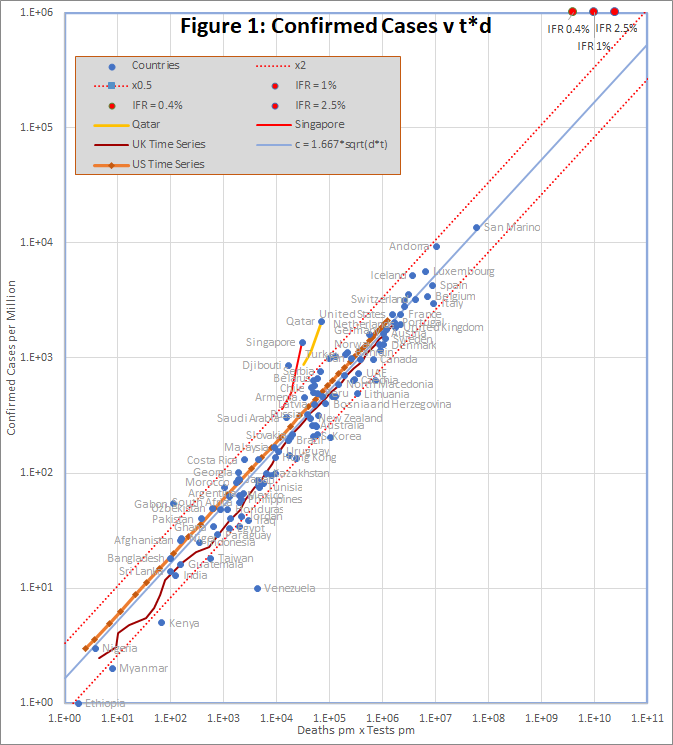
The prediction spans almost 4 orders of magnitude, but even so, almost all countries are within the tramlines, which indicate a factor of 2 either side of the predicted value.
The red dots at the top of the chart represent the hypothetical situation in which the number cases approaches saturation (c = 1 million), and the eventual infection fatality rate is 0.4%, 1% or 2.5%. The hypothesis is that, in that situation, a time series trace would deviate upwards from the best fit line, so that it could reach the point corresponding to the actual infection fatality rate.
There are many reasons to expect data from different countries to differ, including:
- Different health systems – some primitive, and others advanced
- Overloading makes even advanced health systems less effective
- Different demographics – Covid-19 is worse for older populations
- Time lags – e.g. confirmed cases may not survive, and reports may be delayed
- Different criteria for counting deaths
- Political massaging of published data
The conclusion is that all of these factors combine to a factor of up to about 2.
There are 2 interesting exceptions on the chart, namely Qatar and Singapore. In Singapore, the number of cases increased by a factor of 3.8 in a period when the number of tests increased by only 1.3. For Qatar it was 2.4 and 1.4. In both cases, the increase seems to caused by the discovery of infection hot-spots among expatriate workers. For example the Singapore MOH issued a press release on 2oth April saying “As of 20 April 2020, 12pm, the Ministry of Health (MOH) has preliminarily confirmed an additional 1,426 cases of COVID-19 infection in Singapore, the vast majority of whom are Work Permit holders residing in foreign worker dormitories. 16 cases are Singaporeans/ Permanent Residents.”
4. UK and US Time Series with “Future Death” Data
Although the hypothesis of section 1 appears to fit the data well, it was noted that a better proxy for the current infection rate might be the death rate in a few days time, reflecting the fact that there in most fatal cases, death happens some days after the infection is confirmed. In this section, I will examine this idea using time series data for the UK and US.
Historic data for the UK and US was downloaded from https://github.com/tomwhite/covid-19-uk-data/blob/master/data/covid-19-indicators-uk.csv and https://covidtracking.com/data/us-daily.
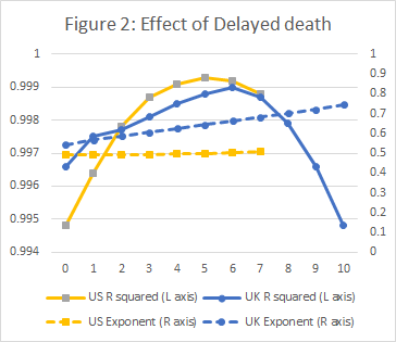
A preliminary study with varying number of days’ delay, established that for the UK, a 6 day delay produced a slight but probably significant improvement to the regression; a clearly visible improvement was found with a 5 day delay for US data. The results are shown in Figure 2.
The resulting plots of c against t.d are shown below. The two plots also show “True” cases at each date; these represent an initial estimate of the true infection rate in the entire population. The number of confirmed cases is proportional to tn , where n is the exponent found by the regression (about 0.5). If c is scaled by a factor (1E6/t)n , we get an estimate of what c would be if we tested the entire population.
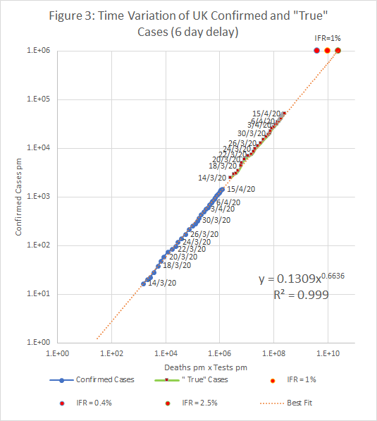
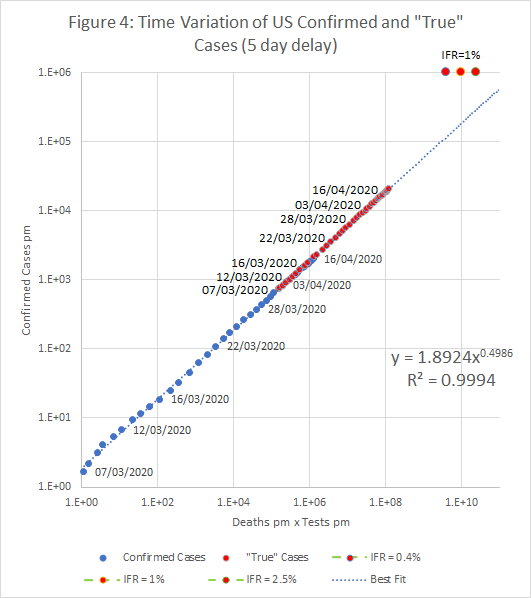
If the “True” case estimate is correct, then there around 3.5 million cases (5.2%) in the UK on the 15th April, and 6.6 million (2.2%) in the US on 16th April.
5. Estimates of the Current Infection Rate
As noted above, a first estimate of the “true” infection rate can be obtained by assuming that the “best fit” equation holds if we simply scale the number of cases by (1E6/t)n . However, it’s clear that it must break down at some point. For example, if we plug c = t = 1 million (i.e. the entire population is infected), into the best fit equations found in sections 3 and 4, the projected infection fatality (IFR) is unrealistically high – more than 10%. To reach a realistic IFR, the curve must turn up at some point towards the red spots, which represent IFRs of 0.4%, 1% and 2.5%.
However, it’s not clear what happens if we increase t to saturation, but not c. The model appears to hold in countries that perform up to 100 tests for every confirmed case, or up to about 10,000 tests per death. A possible procedure is to assume that the scaling formula works when tests are increased until one of these thresholds (t/c or t/d) is met. At that point consider 3 alternative scenarios, as central estimate, and upper and lower bounds:
- The formula continues to apply as t is increased.
- The entire population is infected at the same rate as the tested population (upper bound)
- Contact tracing has been completely successful, and there are no cases in the untested population (lower bound).
Figure 5 shows the time variation of the central estimate and bounds in the UK using the time series with deaths shifted back by 6 days (Figure 3).

In cases where the true infection rate is determined accurately by random sampling, it should be possible to use the results to calibrate this model, allowing more precise estimates of infection rates where no sampling evidence is available.